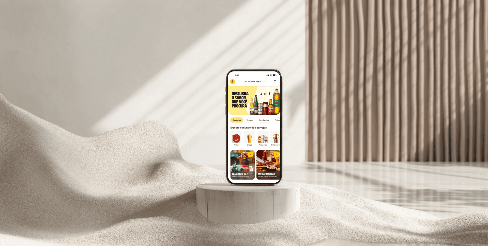
Tada Delivery app
Online Payment Redesign
Role
Senior Product Design
Year
2023
Industry
Drinks Delivery
TaDa Delivery is an AB-InBev DTC (direct-to-consumer) mobile app that serves drink delivery across 12 countries in Latin America. Amid a technological migration focused on enhancing scalability and enabling greater customization, I took charge of leading the improvement of the payment experience—a critical feature that demanded attention.
Feature Overview
At the time, online payments were supported in six South American countries, but the adoption rates were strikingly low. Most users opted for on-delivery payments, citing major concerns about security and frustrations with the limited functionality of the existing system.
This created a significant challenge for us: How could we build trust in the online payment experience while simultaneously improving its functionality to meet user expectations?
Stage 1: Framing the Problem
The project kicked off with an in-depth exploration of user feedback and analytics. By diving into the data and engaging directly with users, we identified three key challenges that were driving frustration:
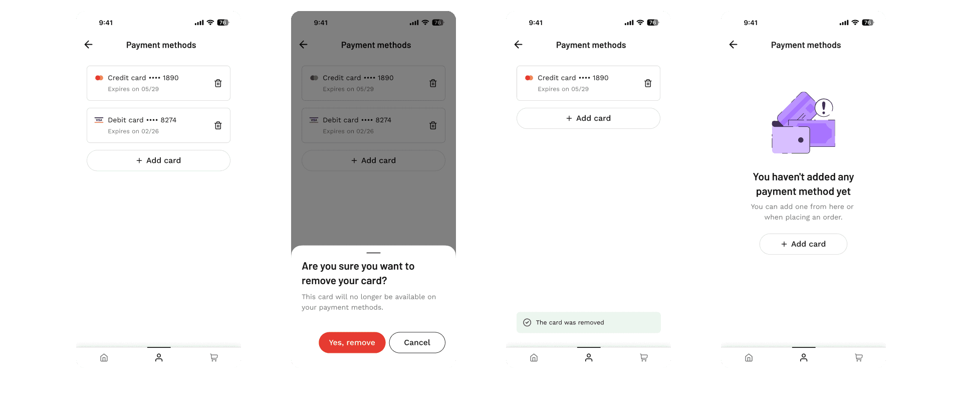
Problem 1: Inability to remove card information from the app
"I wanted to delete my card details after a purchase, but there’s no option. It makes me worry about my data security."
This was a major red flag, as it directly impacted users' trust in the app.
Problem 2: Inability to use international credit/debit cards
"I tried using my international card while traveling, but it just didn’t work. It’s really inconvenient."
This limitation was particularly frustrating for frequent travelers, leading to dropped orders.
Problem 3: Inability to manage payment methods
"I wish I could add or update my payment methods, but the app doesn’t let me. It’s such a hassle!"
The lack of flexibility created friction for users, reducing the likelihood of repeated online payments.
Understanding the Payment Technologies
The project was part of TaDa's integration strategy with BEES Bank technology, utilizing a third-party payment gateway that offered a web view solution.
While the web view solution enabled seamless integration, it also presented a set of challenges. The limited ability to customize the user interface was a constraint that initially felt like a roadblock.

Instead of letting this limitation define the user experience, I collaborated closely with the development team to explore creative ways to optimize it.
By focusing on key usability enhancements, like intuitive card management flows and error-proof interactions, we ensured that users could navigate the system with confidence, even within the constraints of the web view solution.
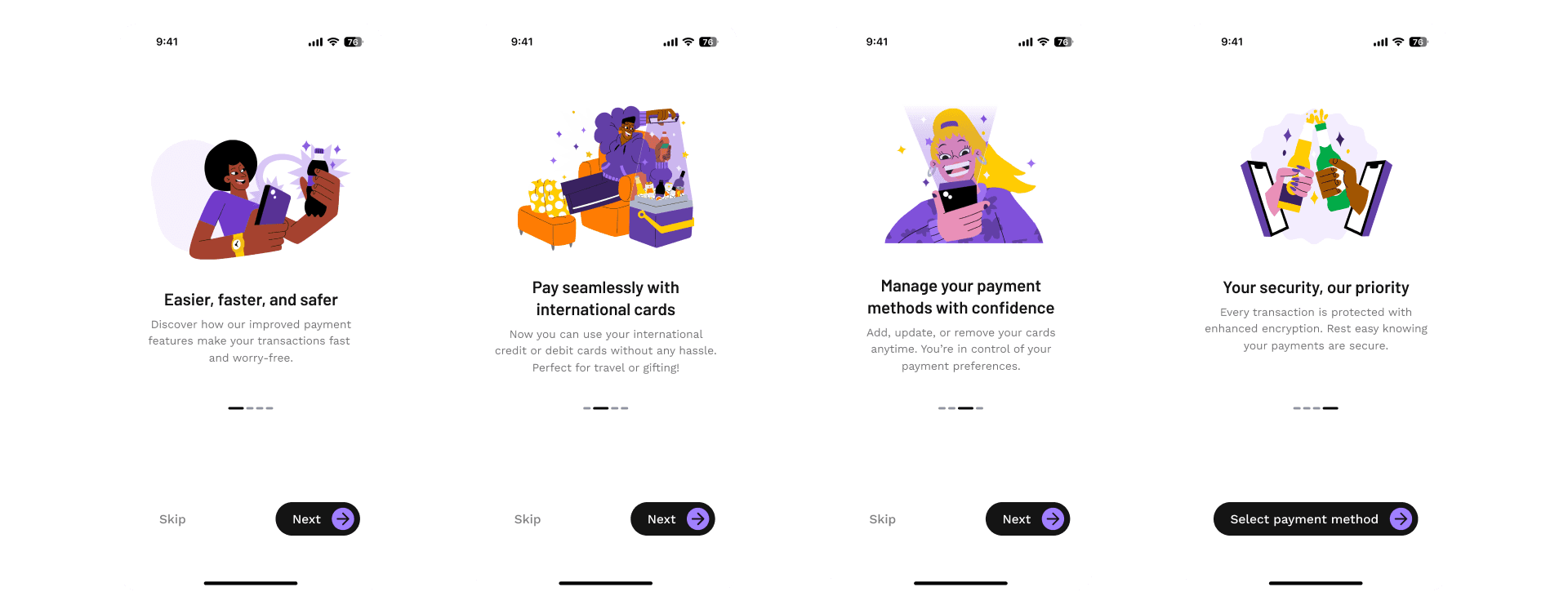
Stage 2: Discovery and Ideation
To guide our team's decisions and explore possible solutions, we used How Might We (HMW) questions that addressed the specific problems and also gathered the current data we had to get a sense of what was critical.
How might we ensure users feel secure managing their payment details?
How might we make online payments seamless and accessible for users with international cards?
How might we provide users with greater flexibility in managing their payment methods?
During brainstorming sessions, I worked with stakeholders to prioritize features based on user value and feasibility. This stage required constant alignment with engineering, especially when balancing ambitious ideas with technical constraints.
Stage 3: Research and Benchmarking
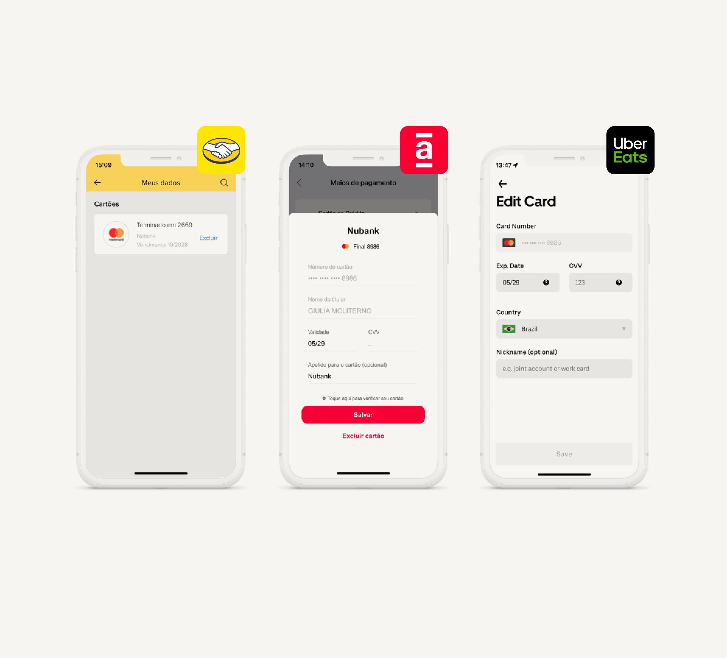
To guide the design process, market research was conducted on best practices of online payment solutions from over 10 delivery and e-commerce apps.
TaDa Delivery is an AB-InBev DTC (direct-to-consumer) mobile app that serves drink delivery across 12 countries in Latin America. Amid a technological migration focused on enhancing scalability and enabling greater customization, I took charge of leading the improvement of the payment experience—a critical feature that demanded attention.
Feature Overview
At the time, online payments were supported in six South American countries, but the adoption rates were strikingly low. Most users opted for on-delivery payments, citing major concerns about security and frustrations with the limited functionality of the existing system.
This created a significant challenge for us: How could we build trust in the online payment experience while simultaneously improving its functionality to meet user expectations?
Stage 1: Framing the Problem
The project kicked off with an in-depth exploration of user feedback and analytics. By diving into the data and engaging directly with users, we identified three key challenges that were driving frustration:
Problem 1: Inability to remove card information from the app
"I wanted to delete my card details after a purchase, but there’s no option. It makes me worry about my data security."
This was a major red flag, as it directly impacted users' trust in the app.
Problem 2: Inability to use international credit/debit cards
"I tried using my international card while traveling, but it just didn’t work. It’s really inconvenient."
This limitation was particularly frustrating for frequent travelers, leading to dropped orders.
Problem 3: Inability to manage payment methods
"I wish I could add or update my payment methods, but the app doesn’t let me. It’s such a hassle!"
The lack of flexibility created friction for users, reducing the likelihood of repeated online payments.
Understanding the Payment Technologies
The project was part of TaDa's integration strategy with BEES Bank technology, utilizing a third-party payment gateway that offered a web view solution.
While the web view solution enabled seamless integration, it also presented a set of challenges. The limited ability to customize the user interface was a constraint that initially felt like a roadblock.
Instead of letting this limitation define the user experience, I collaborated closely with the development team to explore creative ways to optimize it.
By focusing on key usability enhancements, like intuitive card management flows and error-proof interactions, we ensured that users could navigate the system with confidence, even within the constraints of the web view solution.
Stage 2: Discovery and Ideation
To guide our team's decisions and explore possible solutions, we used How Might We (HMW) questions that addressed the specific problems and also gathered the current data we had to get a sense of what was critical.
How might we ensure users feel secure managing their payment details?
How might we make online payments seamless and accessible for users with international cards?
How might we provide users with greater flexibility in managing their payment methods?
During brainstorming sessions, I worked with stakeholders to prioritize features based on user value and feasibility. This stage required constant alignment with engineering, especially when balancing ambitious ideas with technical constraints.
Stage 3: Research and Benchmarking
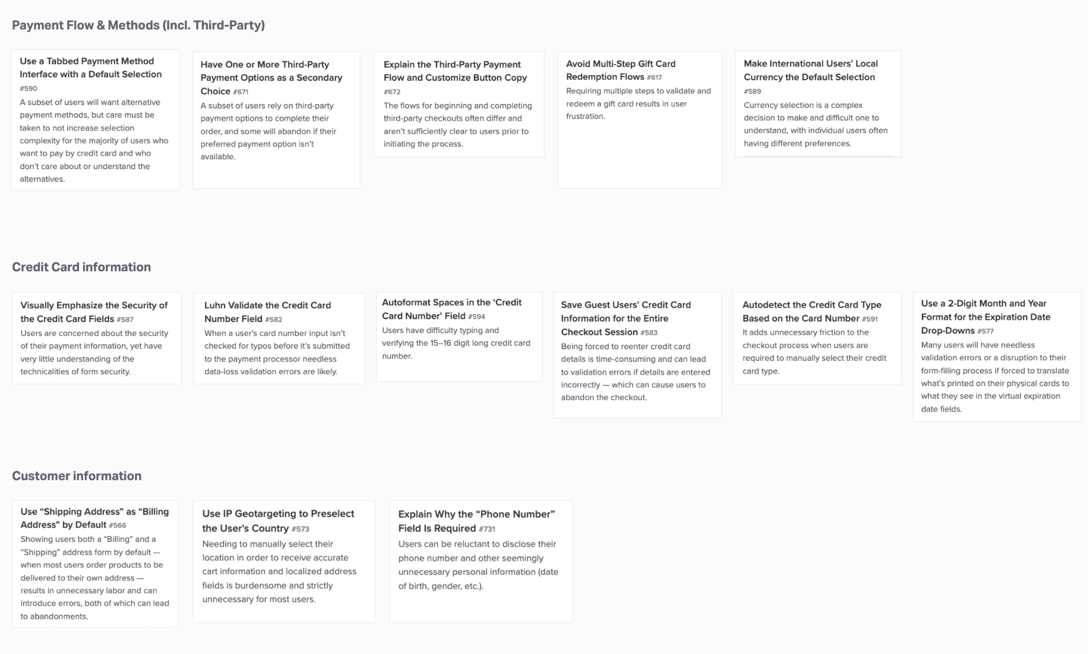
To guide the design process, market research was conducted on best practices of online payment solutions from over 10 delivery and e-commerce apps.
Payment methods
8/10 apps
offer credit or debit options as the main payment method.
2/10 apps
offer credit and debit as separate payment methods to choose from.
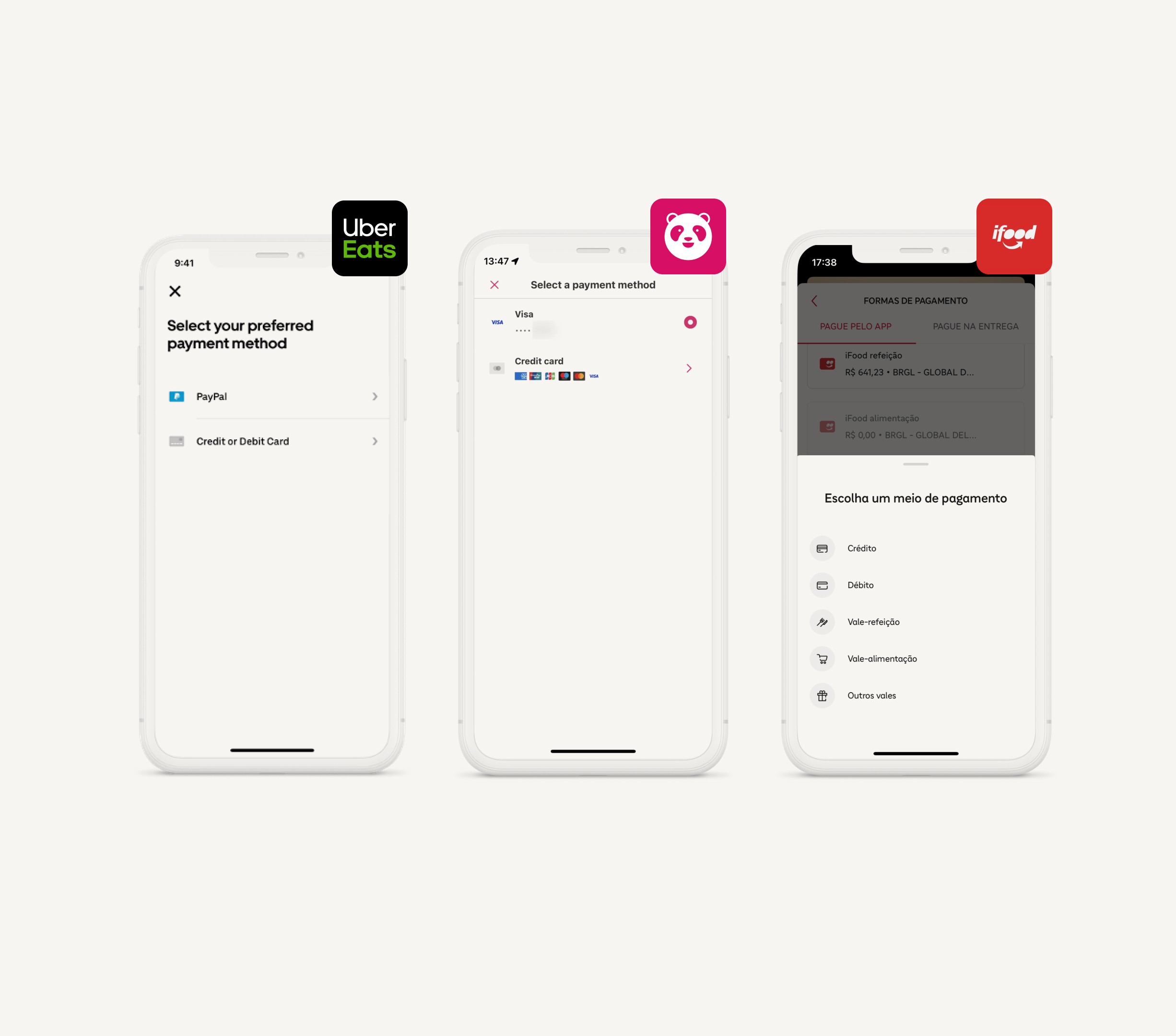
Displaying saved cards
6/10 apps
have a payment method section where the user can see the list of cards saved and have the ability to manage them.
4/10 apps
have a wallet section with cards saved and users are able to manage and view their transactions on a single screen.
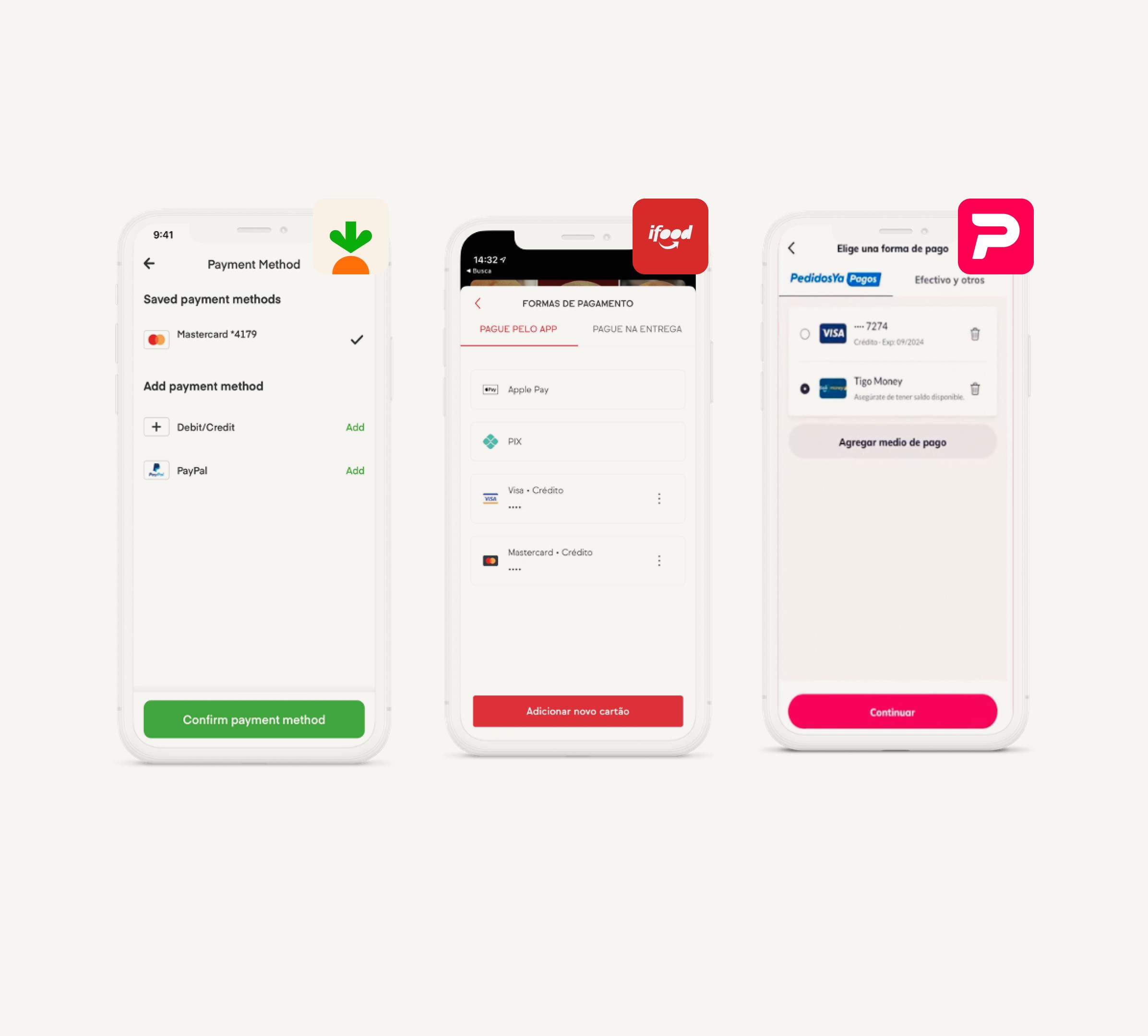
Managing payments
10/10 apps
allow users to delete their card information when managing their payment methods.
5/10 apps
allow users to edit their card CVV or expiration date. They also allow adding
a card nickname.
Additionally, UX recommendations from Baymard Institution's research studies were gathered to identified industry best practices, user expectations, and common pain points.
Additionally, UX recommendations from Baymard Institution's research studies were gathered to identified industry best practices, user expectations, and common pain points.
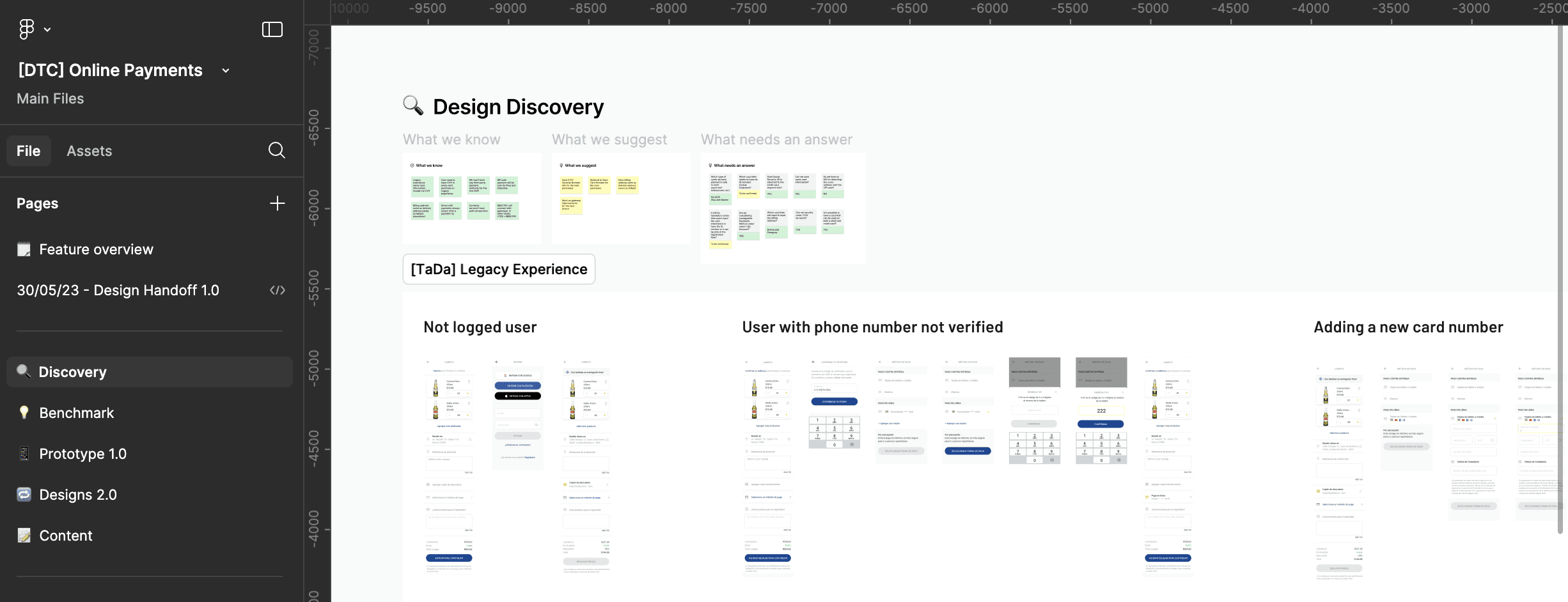
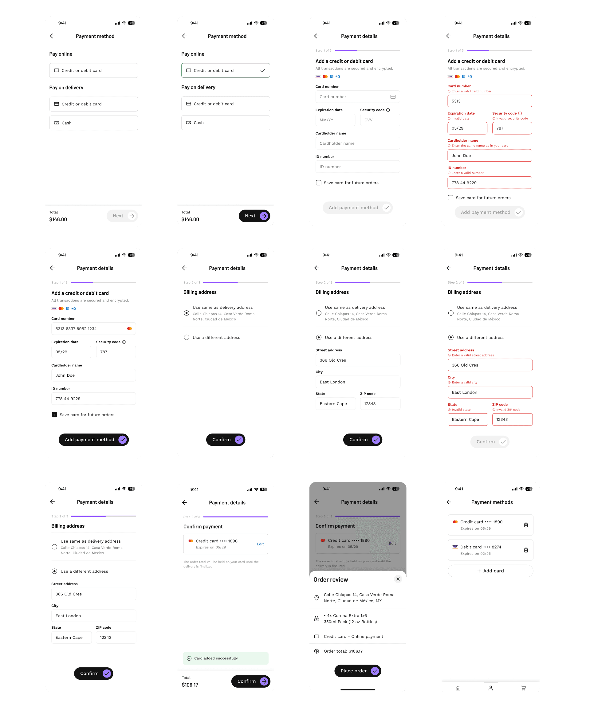
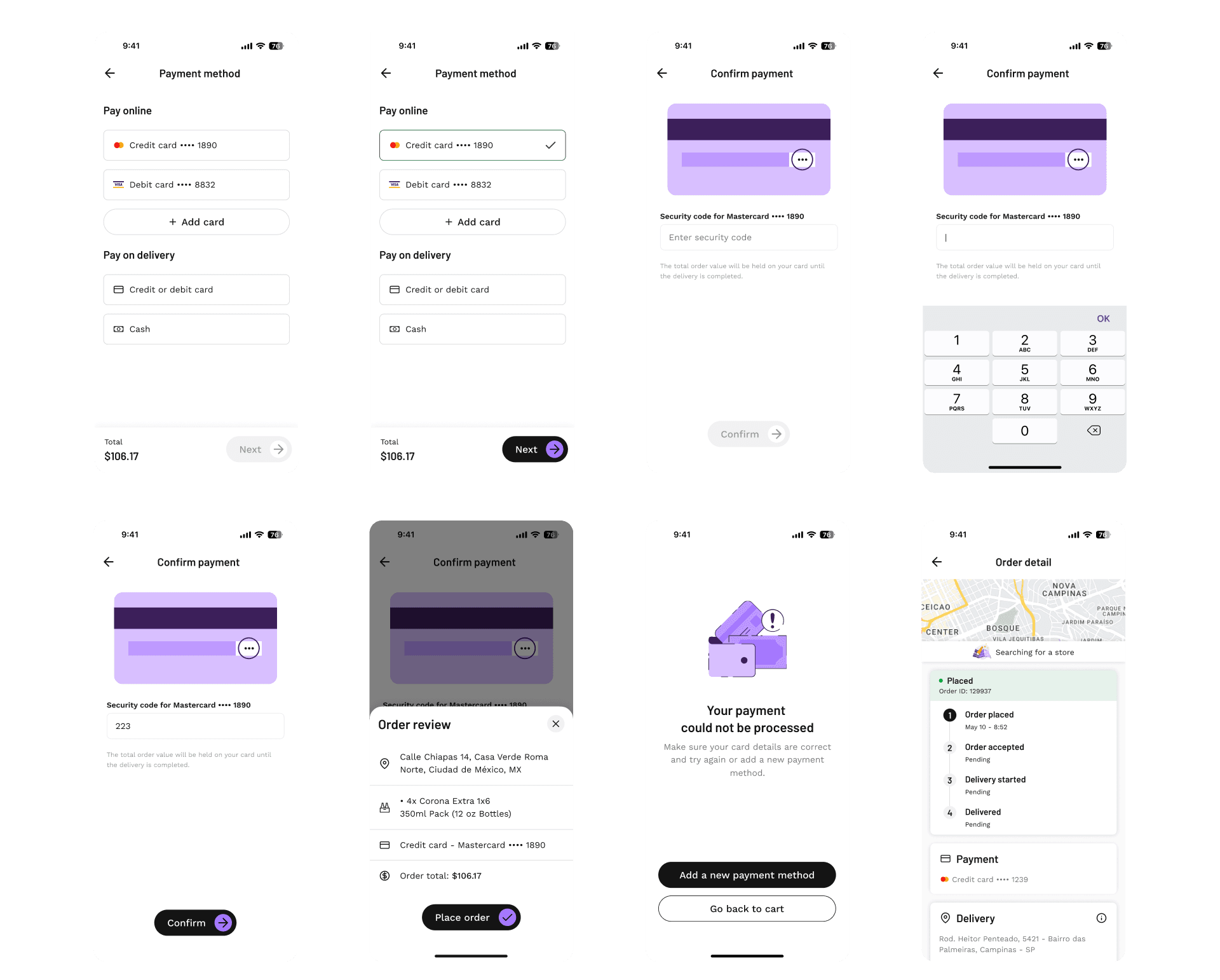
Stage 4: Prototyping and Testing
Sketching wireframes to map user flows for critical features and interactions revealed friction points, which were addressed through usability testing and peer reviews. The primary challenge was simplifying complex flows without compromising functionality.
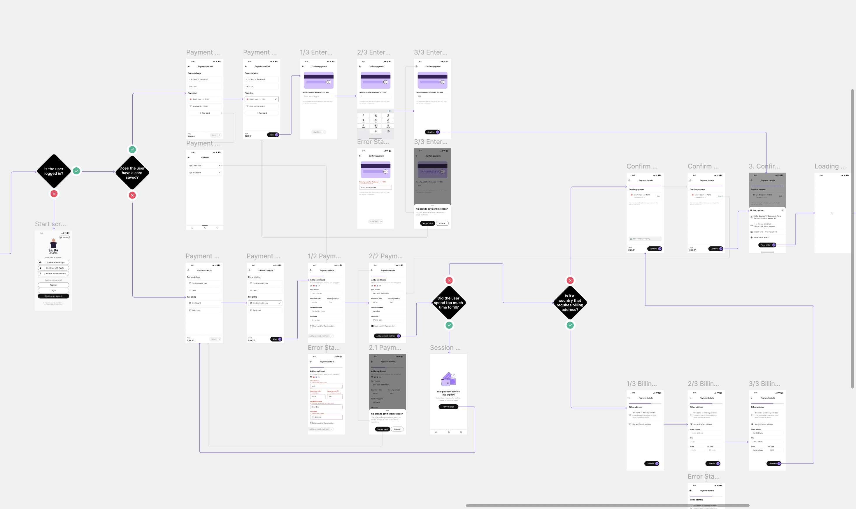
When the designs reached the high-fidelity stage, they were refined with detailed UI elements. Key features such as error states, confirmation prompts, and localized content for different countries were integrated to ensure a seamless and intuitive experience in all target markets.
Stage 5: Handoff and Implementation
The handover process was a critical milestone. I created a design specification document to ensure a smooth transition to development. This included annotated user flows, edge cases, and interaction details.
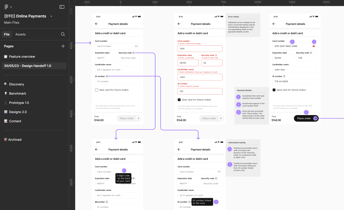
I also worked closely with the development and QA teams during the implementation phase to identify and resolve issues early, saving time and resources.
Stage 6: Launch and Post Implementation Review
The launch was both exciting and nerve-wracking. I closely monitored key metrics such as online payment acceptance rates and GMV growth to measure the impact of the new features.
Unexpected Setbacks
Initially, adoption didn't increase as quickly as expected. A post-launch survey revealed that users were still hesitant to try online payments due to habits and past experiences.
Solutions Provided
So we phased the implementation of some features, releasing small improvements gradually, such as an onboarding flow to educate users about the new features and emphasize security measures. This addition significantly increased adoption rates in the months that followed.
Stage 4: Prototyping and Testing
Sketching wireframes to map user flows for critical features and interactions revealed friction points, which were addressed through usability testing and peer reviews. The primary challenge was simplifying complex flows without compromising functionality.
When the designs reached the high-fidelity stage, they were refined with detailed UI elements. Key features such as error states, confirmation prompts, and localized content for different countries were integrated to ensure a seamless and intuitive experience in all target markets.
Stage 5: Handoff and Implementation
The handover process was a critical milestone. I created a design specification document to ensure a smooth transition to development. This included annotated user flows, edge cases, and interaction details.
I also worked closely with the development and QA teams during the implementation phase to identify and resolve issues early, saving time and resources.
Stage 6: Launch and Post Implementation Review
The launch was both exciting and nerve-wracking. I closely monitored key metrics such as online payment acceptance rates and GMV growth to measure the impact of the new features.
Unexpected Setbacks
Initially, adoption didn't increase as quickly as expected. A post-launch survey revealed that users were still hesitant to try online payments due to habits and past experiences.
Solutions Provided
So we phased the implementation of some features, releasing small improvements gradually, such as an onboarding flow to educate users about the new features and emphasize security measures. This addition significantly increased adoption rates in the months that followed.
Outcomes
By addressing the core issues and focusing on user trust, the project not only improved the payment experience but also laid a strong foundation for future iterations.
Outcomes
By addressing the core issues and focusing on user trust, the project not only improved the payment experience but also laid a strong foundation for future iterations.
Adoption Rate Increase
Online payment usage increased by 35% in the first three months post-launch, across the 12 countries in production.
Operational Efficiency
Reduction in failed transactions by 40%, decreasing the burden on CX support teams.
Security Perception
Post-launch survey showed that 70% of users felt more confident using online payment, citing the ability to manage and remove card details as
a major factor.
Revenue Growth
20% rise in GMV (Gross Margin Value) was observed, driven by improved payment convenience and security.
User Retention
Customer retention improved by 15%, as users found it easier and more reliable to complete orders online.
User Satisfaction
Positive feedback on payment improvements led to
a 25% increase in app store ratings, with many reviews highlighting the new payment experience.
Other projects